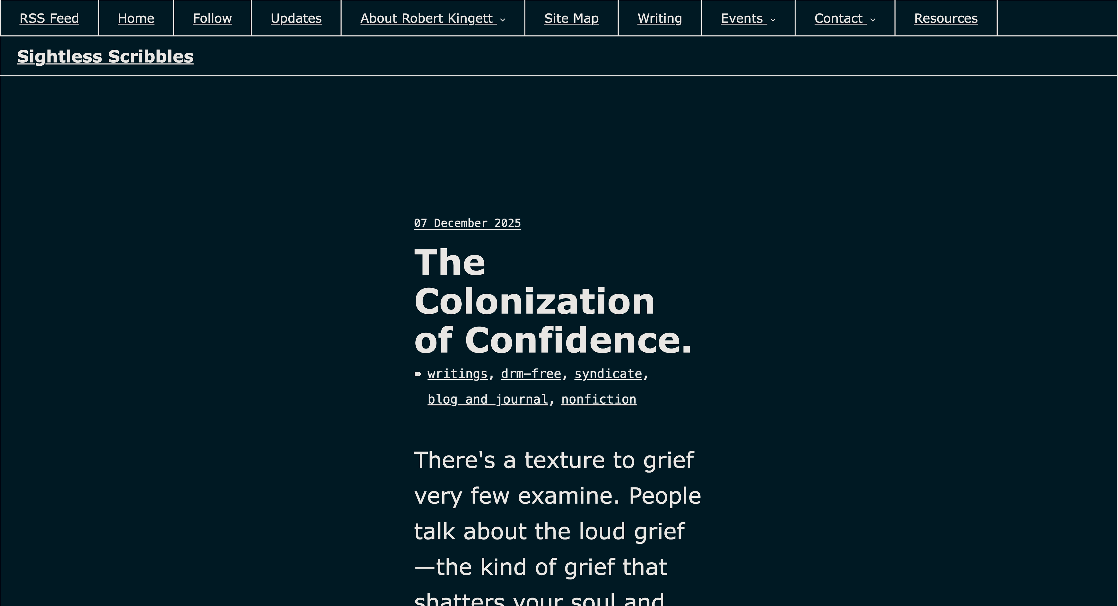
I made some readability updates to my site today after hearing that one of my posts was hard to read.
The changes are meant to make the site more low-vision friendly:
- larger article/list text
- darker body text
- less reliance on italic text for longer notes
- cleaner post previews on category pages
I’m totally blind, so I can test structure, keyboard access, screen reader behavior, headings, and content flow, but I can’t personally judge visual readability.
If you use magnification, low-vision settings, high contrast, dark mode, reader mode, or have visual fatigue/migraine/contrast sensitivity, I’d appreciate feedback.
Does anything still feel too small, too light, too crowded, or visually tiring?
Site: https://lanie.work/
#Accessibility #LowVision #WebAccessibility #GoHugo #Disability #A11y