
Latest NeoDB /Eggplant changes: collections on Home
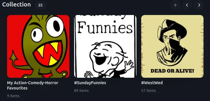
TL,DR: NeoDB collection cover images on the NeoDB Home page used to be best in portrait ratio, so I purposely made images in that ratio. Now the Home page crops those images to squares & my images look terrible on the Home page, often with the collection's name cropped completely or partially out of the square. What to do about this?
Now, the long version 😉
When I first started making collections on Eggplant.place, there was only an empty rectangle & no text representing the collection on my Eggplant Home page. So I had to make & upload my own collection cover images, so that I'd know which was which. Usually with the collection's name as text in the image itself to make it immediately clear what the collection was.
E.g.
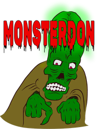 Cover image for the Monsterdon collection. Includes text for the collection's name.
For each new collection, I'd design a cover image with text for the collection's name. Through trial & error, I realized things like:
- Portrait ratio was best for the Home page. (Landscape & square images would get shrunk to fit the width of portrait ratio images.)
- 300x200 seemed the ideal dimensions (or at least, the easiest to remember)
- Preview cards for collection URLs posted on Mastodon would be more square, cutting off top & bottom, so more recently I'd try to make sure for collections that I frequently post to Mastodon that the collection's name was not at the extreme top or bottom, so it would be visible in the Mastodon preview card.
The latest changes to NeoDB/Eggplant.place have changed the display of collection cover images, from 5 whole images to 3 squares, with the top & bottom of portrait ratio images cropped. (Cropped even more than the Mastodon preview cards?) The cover images on the collection pages are unchanged.
All those cover images I made expressly for the design of the NeoDB Home page are now terrible on the Home page, with much/most/all of the collection's name cropped out.
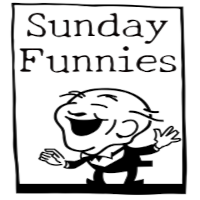
Here's how the Sunday Funnies cover image looked before.

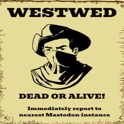
And the WestWed cover.

And here's how they look now on the Home page: Nope, my screenshots are in Webp format & NeoDB won't let me upload a Webp in the body of an article. So see the Featured image at top (where, for some reason, I can upload a Webp🤷♂️).
- Sunday Funnies name now half cropped out to just Funnies.
- WestWed name cropped out completely.
Not sure what to do now:
- I do the work all over again of making cover images for each collection but redesigning them as squares... wondering if they'll still be zoomed/cropped/otherwise modified, now or in future.
- Resize/reshape them to distorted squares. Much easier, but a bit ugly.
- I just leave them as they are.
- Other?
"Squared" examples (option 2)
@aubergine@eggplant.place